Case Study
01
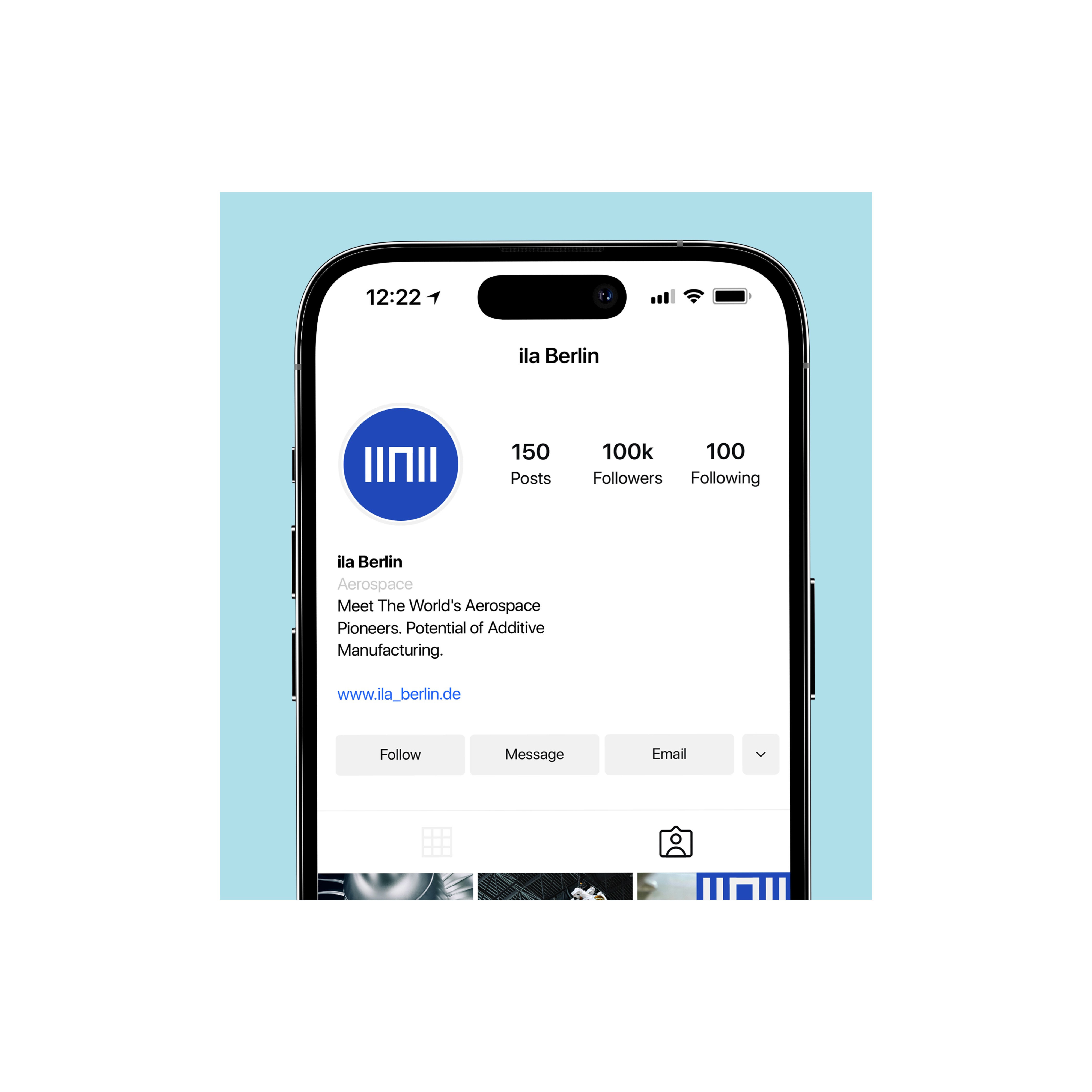
ILA Berlin is one of Europe’s leading aerospace events, connecting aviation, defense, research, and technology industries. The project focused on redesigning the event’s communication system across digital, print, and spatial applications. The existing identity lacked structure across formats, making complex information harder to navigate. The goal was to create a clearer and more usable design framework.
Project Type
Branding & Identity Design
Industry
Aviation & Global Events
Deliverables
Strategy, Identity, Motion, Guidelines
Challenge
02
ILA Berlin operates across many formats — exhibition graphics, presentations, campaigns, editorial layouts, and social media.
The previous communication relied on inconsistent layouts and heavy visual treatment, which reduced clarity and made the brand feel fragmented across applications.

The challenge was creating a system that could organize large amounts of content without adding more visual noise.
The Approach
03
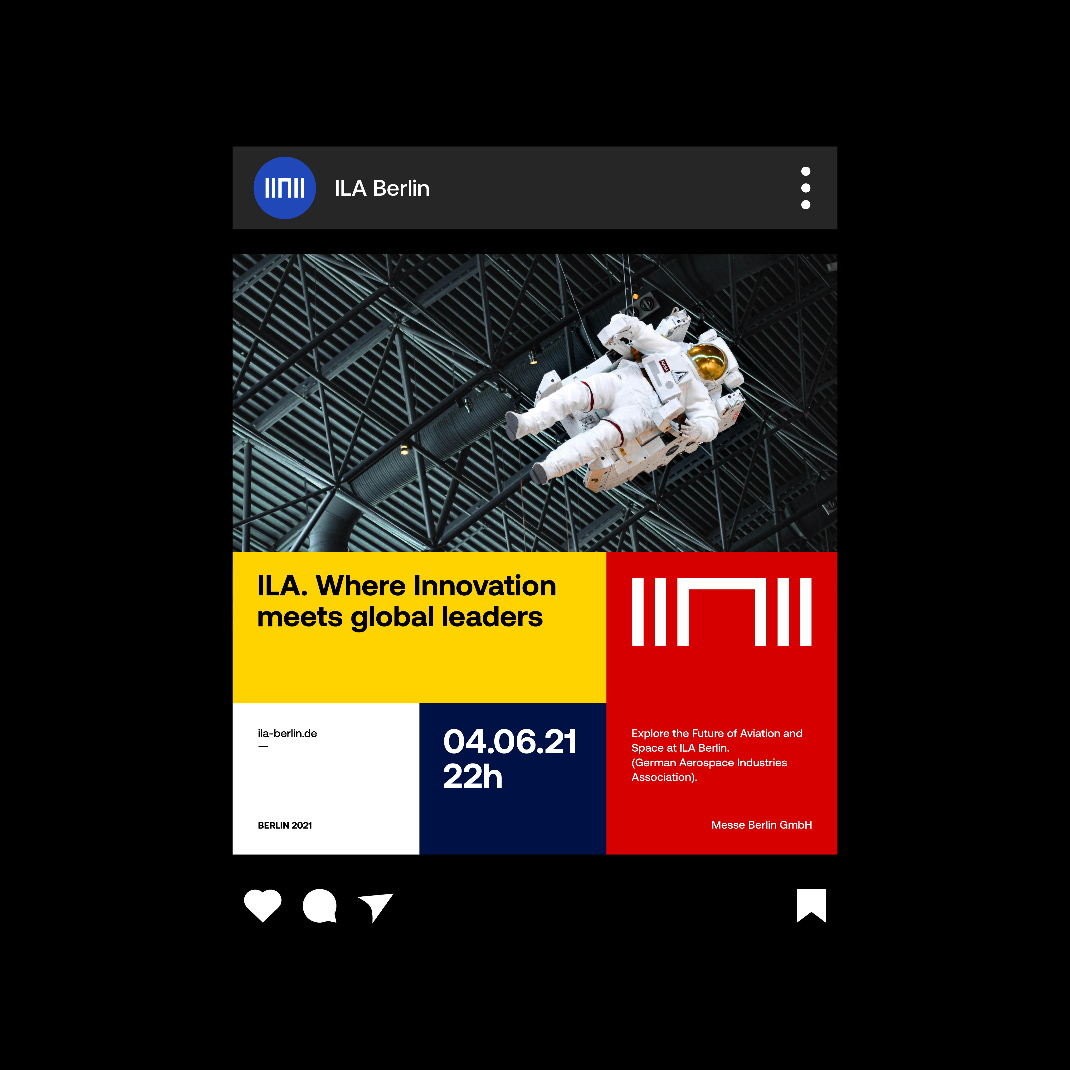
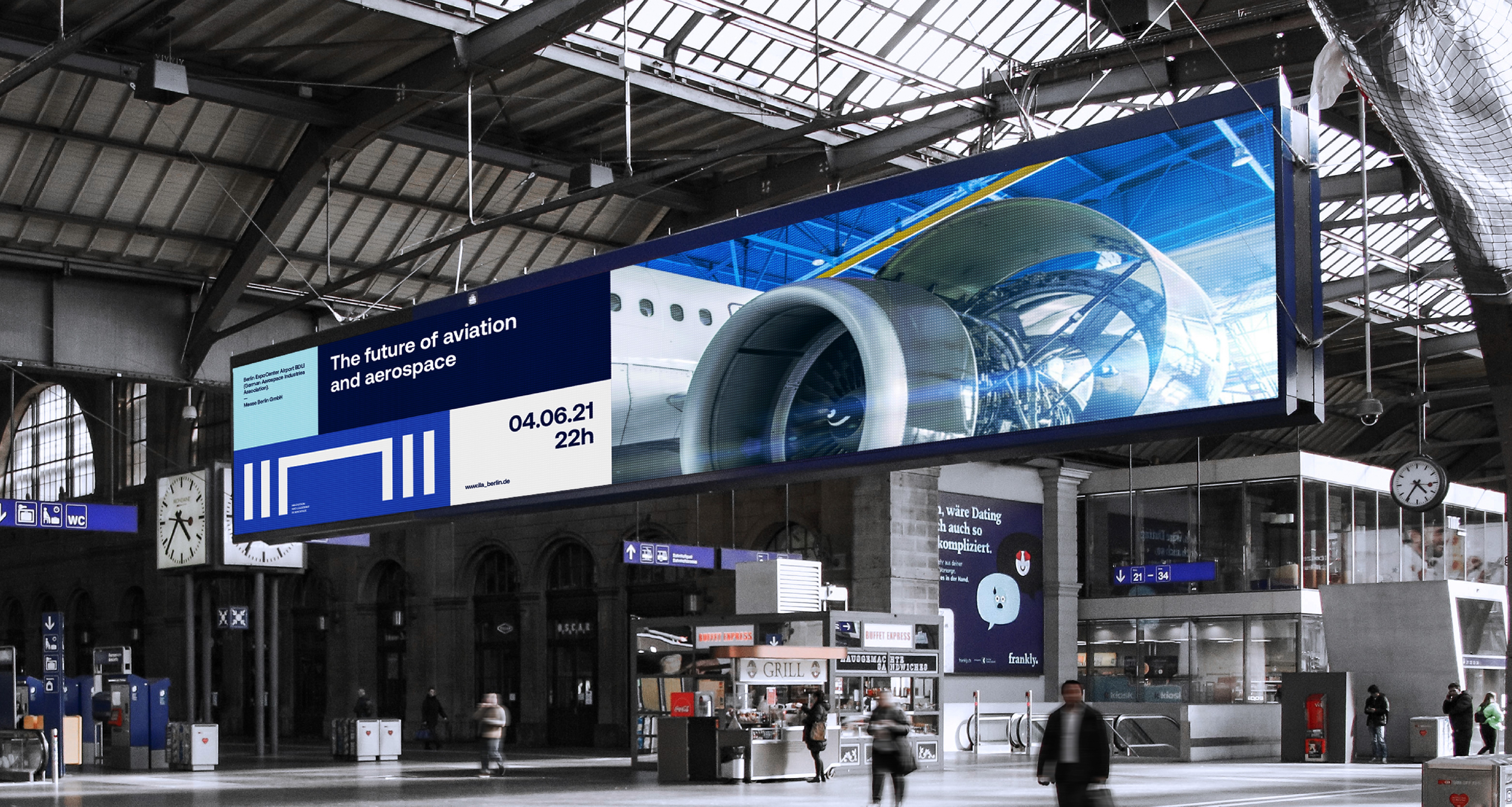
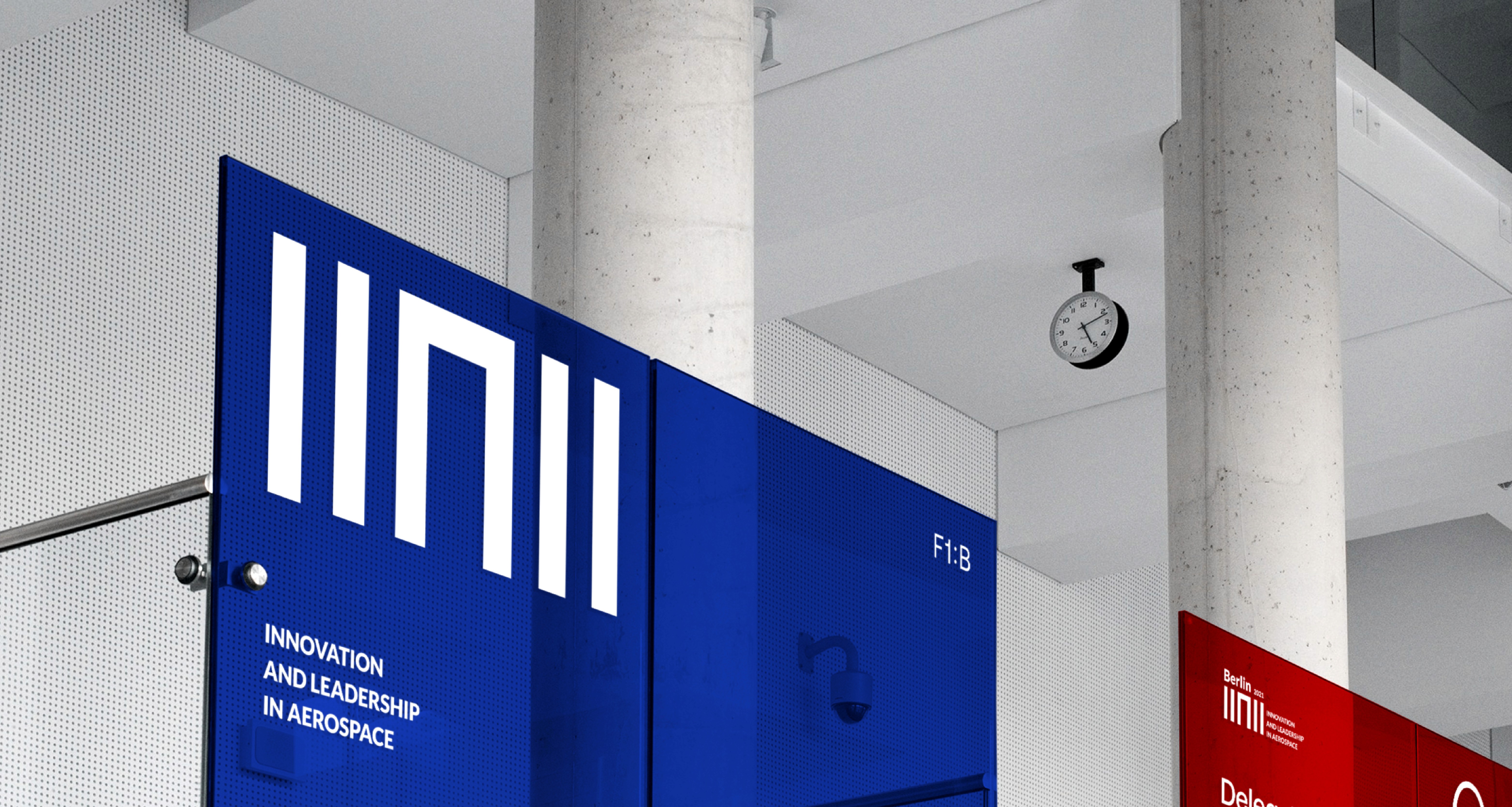
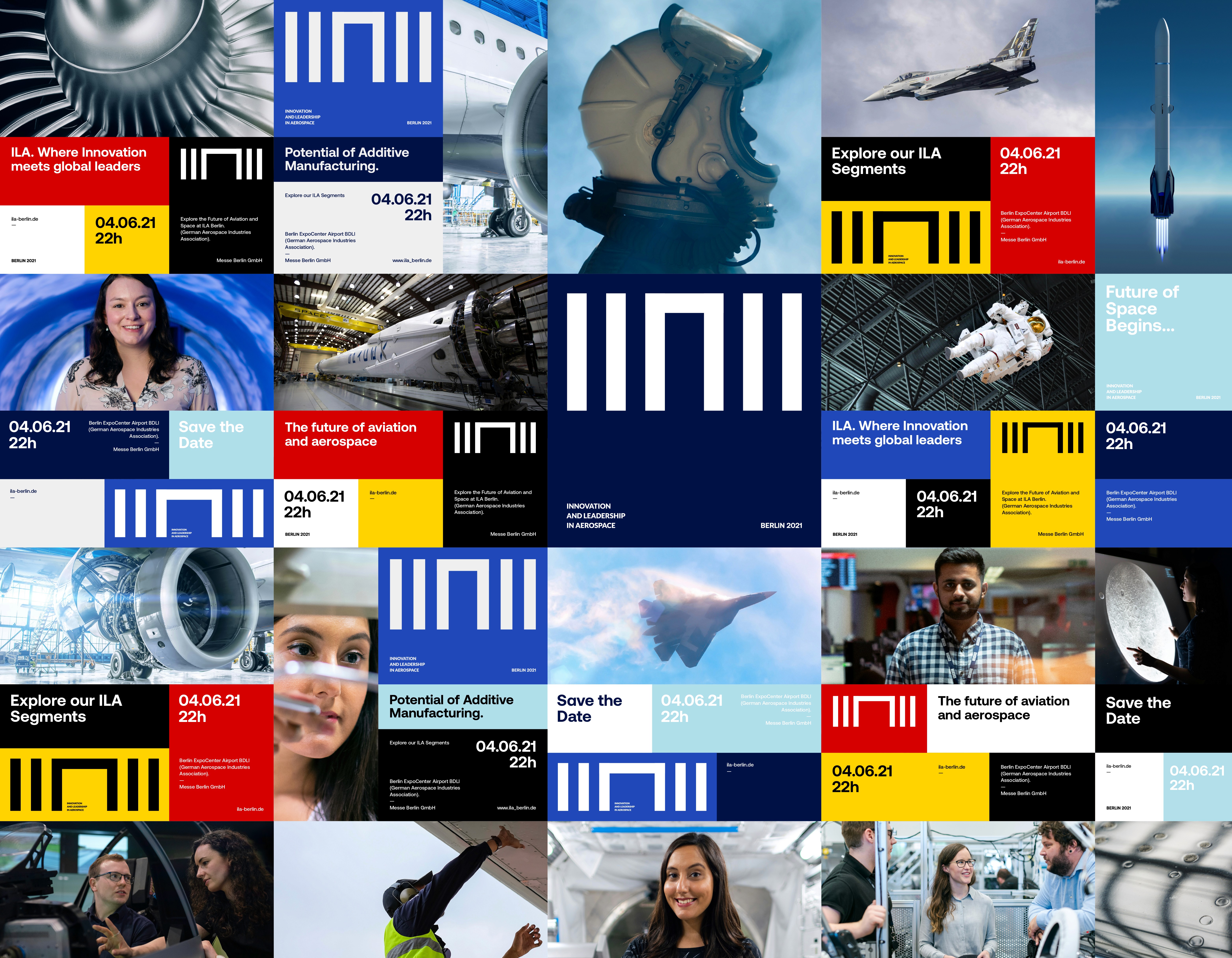
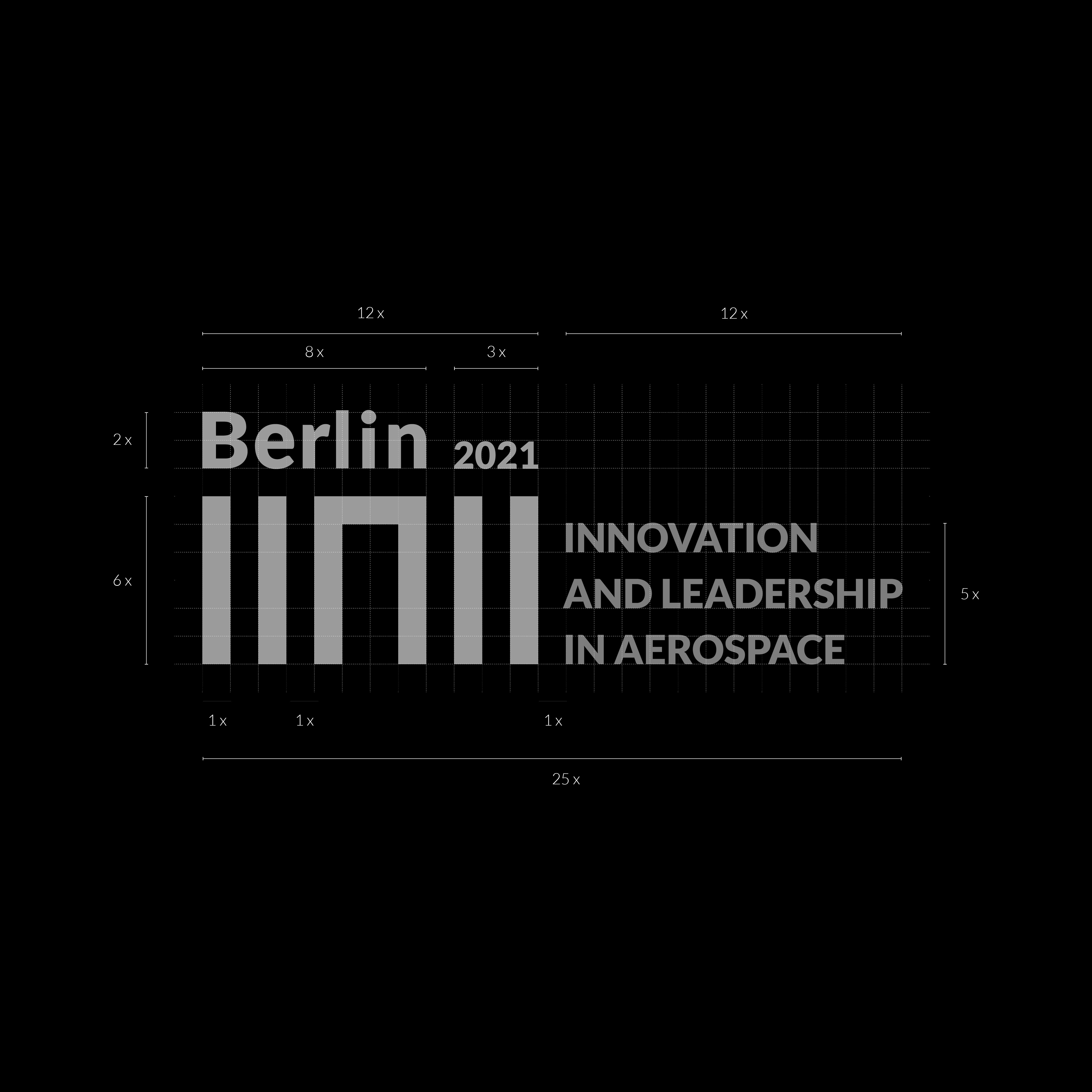
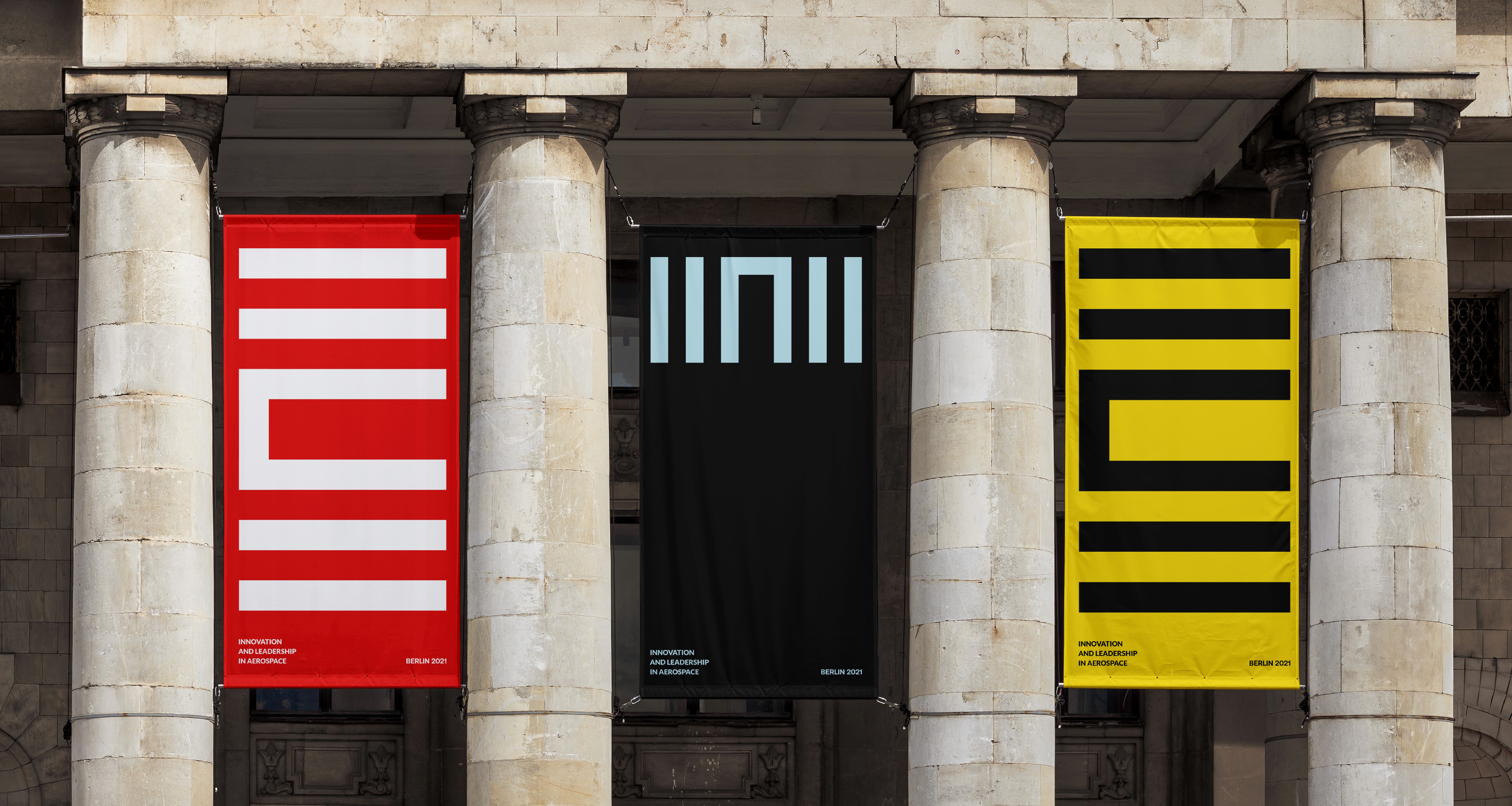
Typography, spacing, and layout behavior were defined first to create a clearer hierarchy across all materials. The visual direction was intentionally restrained, using clean layouts and minimal graphic elements to keep the focus on content. Every design decision was made to improve readability and make the system easier to apply across different formats.

The identity was built around a modular grid and clear typography rules. This created a more consistent layout structure across digital and physical applications while simplifying implementation for internal teams. Graphic elements were used carefully to support the content rather than dominate it.

Outcome
04
The identity was built around a modular grid and clear typography rules.
The identity was built around a modular grid and clear typography rules. This created a more consistent layout structure across digital and physical applications while simplifying implementation for internal teams. Graphic elements were used carefully to support the content rather than dominate it.
The identity was built around a modular grid and clear typography rules. This created a more consistent layout structure across digital and physical applications while simplifying implementation for internal teams. Graphic elements were used carefully to support the content rather than dominate it.